

In the dim and distant past of web building… like a few years ago… building a clickable image grid was only possible for the learned few who knew how to write computer code. Now, thanks to the WordPress Block Editor, this feature is accessible to anybody, including you, with a little time and training.
A clickable image grid is a web design feature that merges visual appeal with practical navigation, enabling users to interact with images that link to other content. Five More Talents highlights that the WordPress Block Editor now makes building these grids accessible to anyone, a task that previously required coding expertise. These grids are a versatile tool for websites, effectively showcasing elements like sermon series, bookstore categories, or ministry opportunities by providing a visual sample of content. For optimal presentation, Five More Talents recommends using a 16:9 or 16:10 aspect ratio for images within the grid, as this is a common size for computer screens.
Side note on training: Consider watching our webinar on using the Block Editor for a live walkthrough.

Why build image grids for your website? Because they’re a blissful combination of beauty and function. The beauty of images, which woo readers’ attention, is combined with the practical nature of a glossary, table of contents, or list of titles. It’s a versatile tool, appropriate for displaying sermon series, bookstore categories, campus locations, ministry opportunities, and much more. It’s a visual sampling, a platter of hors d’oeuvres for your website guests.
So if you’re looking for a beginner-friendly how-to on building a clickable image grid, this is it.
How do I start building a clickable image grid with the WordPress Block Editor?
To start building a clickable image grid with the WordPress Block Editor, begin by creating a new page and giving it a title. Then, add a column block and select the desired number of columns. Within each column, insert an image block and upload images from your media library or new ones. After uploading, save your draft and preview your work. If an unwanted sidebar appears, adjust your theme's sidebar settings (e.g., in Astra, set to No Sidebar). To add more rows, duplicate existing ones and edit images, using the Crop and Aspect Ratio tools (16:9 or 16:10 recommended) to ensure uniform sizing. This process allows you to build your image grid efficiently.

- Add a new block to the page… such as a paragraph, image, button, quote, and more
- Menu, showing you the blocks at your disposal
- Gear, controlling the settings of whichever block you have selected
- Toggle between page-level settings and block-level settings.
- This is an individual block… click on it for a block-specific menu.
- Preview your work before publishing.
Got it? Good.
To build your clickable image grid, begin by creating a new page… go ahead and give it a title. We’re using Image Grid Demo 2 here. Then find the “plus” symbol off to the side, and add a column block.
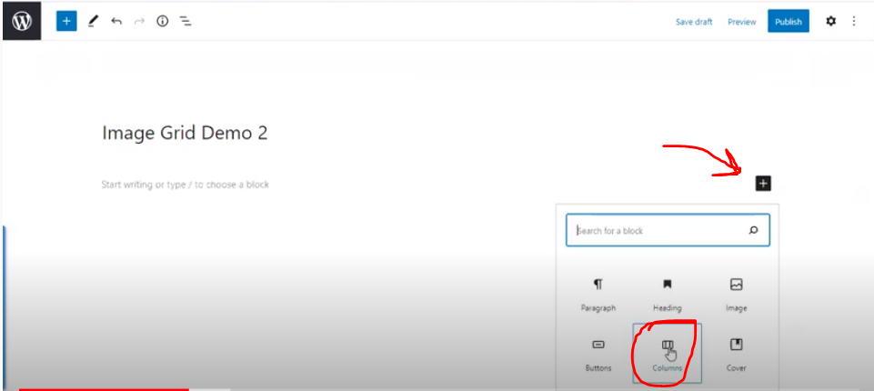
Select the number of columns you want. (Editing column width is a little more complicated; you can actually put a columns block in another columns block. The webinar gives more details on doing this.)
Each column is its own space. Since we’re building an image grid, we’ll put an image block in each column. In each block, you can add images from your media library, or upload the images at this time. Good images are crucial — their quality dictates the quality of your clickable image grid.
Once your suitable and excellent images are uploaded, SAVE YOUR DRAFT and preview your work. (Buttons for both actions are in the top right corner of your screen.)
You might see a problem… Depending on your theme’s settings, a sidebar may appear where no sidebar ought to be. Like this:

If you want a sidebar, feel free to leave it. If you don’t, click on the top right gear and open the settings. Each theme’s settings may be slightly different. In the Astra theme, as in this example, you can scroll down to Sidebar Settings and set it to No Sidebar.
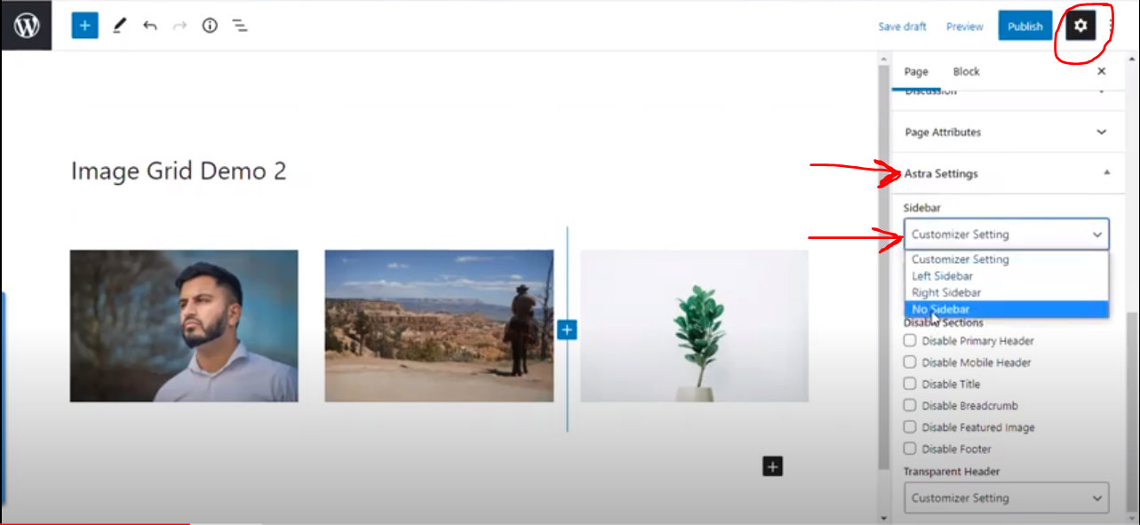
Change it, save it, and preview your draft again… and the sidebar should be gone.
To begin another row, just duplicate the existing one, then edit the images like you did for the first one.

Your pictures may look uneven if they’re different sizes. No worries, you can edit their presentation size quite easily.
To do this, click the image… then the Crop tool… then the Aspect Ratio tool. With Aspect Ratio, you’re not left eyeballing your crop job, but can guarantee uniform size for the row. We recommend the 16:9 or 16:10 ratio for a pleasing shape. It’s a common size for computer screens. Remember to click Apply once you’ve made your changes.

Adding Links
And now for the clickable part!
Select your image. Click on the link button. You can add the URL by searching for content you know already exists on your site, or by copy and pasting the link from another source.

Enter the link, save your draft, and preview it… and your clickable images will take you where you wanted to go. Yahoo!
You may want to add buttons below each block. Both the button and the image can be clickable.
Select your image, click the plus sign below it, and add a Button block. Type your desired text into the button. Add the link the same way as for the image.
To center the button below the image, click the list icon at the top of the page and select Buttons. Then you can choose to Justify Center.

And that’s it! We didn’t get into everything, of course, but by following this tutorial, you’re well on your way to building your own clickable image grid. For a more detailed walkthrough, check out our webinar. Happy web crafting!
Frequently Asked Questions
- 1 How can I create a clickable image grid on my church website using the WordPress Block Editor?
-
The WordPress Block Editor makes building clickable image grids accessible without requiring coding knowledge. You begin by adding a column block to your page, then place an image block within each column, and upload your desired images from your media library or by uploading new ones.
- 2 What are some practical uses for a clickable image grid on a church or ministry website?
-
Clickable image grids are versatile tools for church websites, combining visual appeal with functionality. They can effectively display sermon series, categorize bookstore items, highlight campus locations, or showcase various ministry opportunities, acting as a visual sampling for your website guests.
- 3 What are the initial steps to build an image grid using the WordPress Block Editor?
-
To begin, create a new page and give it a title. Then, find the "plus" symbol to add a column block, selecting your desired number of columns. Within each column, insert an image block and upload the images you wish to feature, then save your draft and preview your work.
- 4 Is it possible to adjust the width of columns in an image grid, and where can I find more advanced guidance?
-
Yes, column widths can be adjusted, and more complex layouts can be achieved by nesting column blocks within each other. The page mentions that a webinar provides more detailed instructions and a live walkthrough on these advanced editing techniques for columns.


